
Created on 99designs by Vista
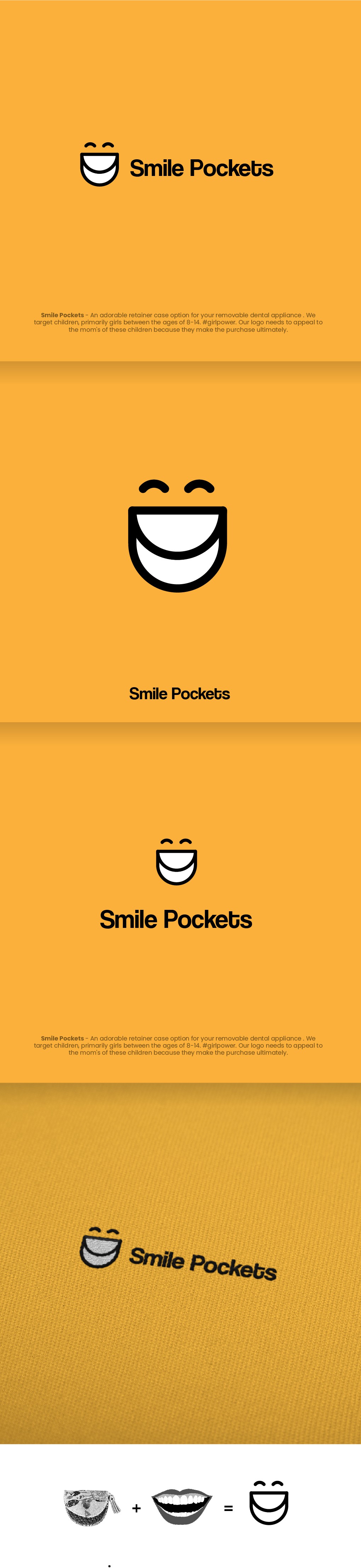
To make this logo, I used basic geometric shapes to generate an ambiguous figure that looks as a smile, and at the same time as one of the pockets that Smile Pockets produces. In this way we get an original, fun, creative brand with an icon that communicates with total simplicity and effectivity the 2 main axes of the brand.