A Flyer Design For A Self Storage Company

1
Created on 99designs by Vista
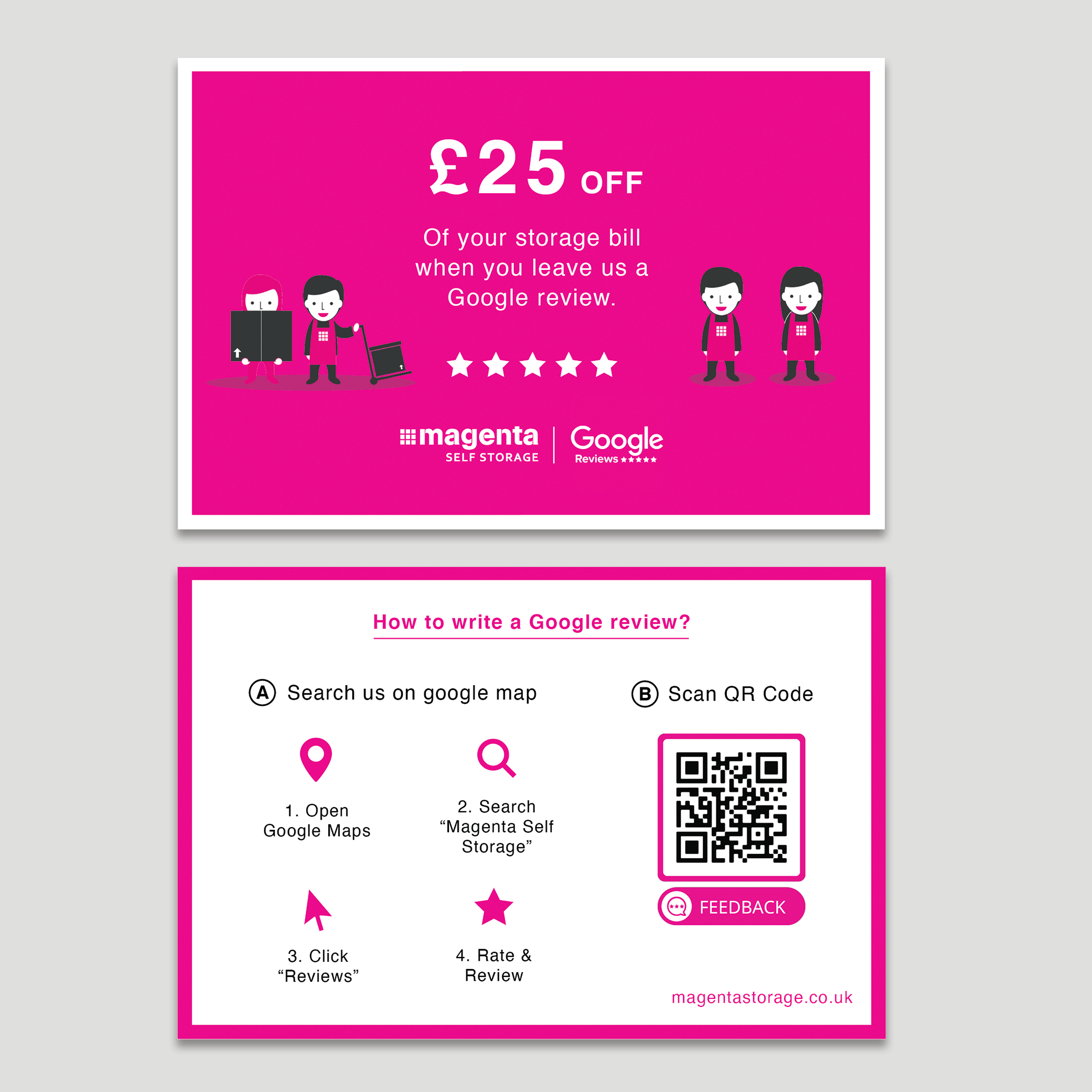
Based on the client's first feedback, I added more elements (Meganta logo side by side with Google review logo, more graphic elements to increase visual engagement) on the front side to help clarify the message for quick understanding in just a few seconds of attention span. Think both horizontal and vertical layout work, as long as the elements are placed in a way to create visual balance.